Cork Paints
An imaginary painting workshop based in Cork, Ireland that is easy to book and inclusive to all skill levels.
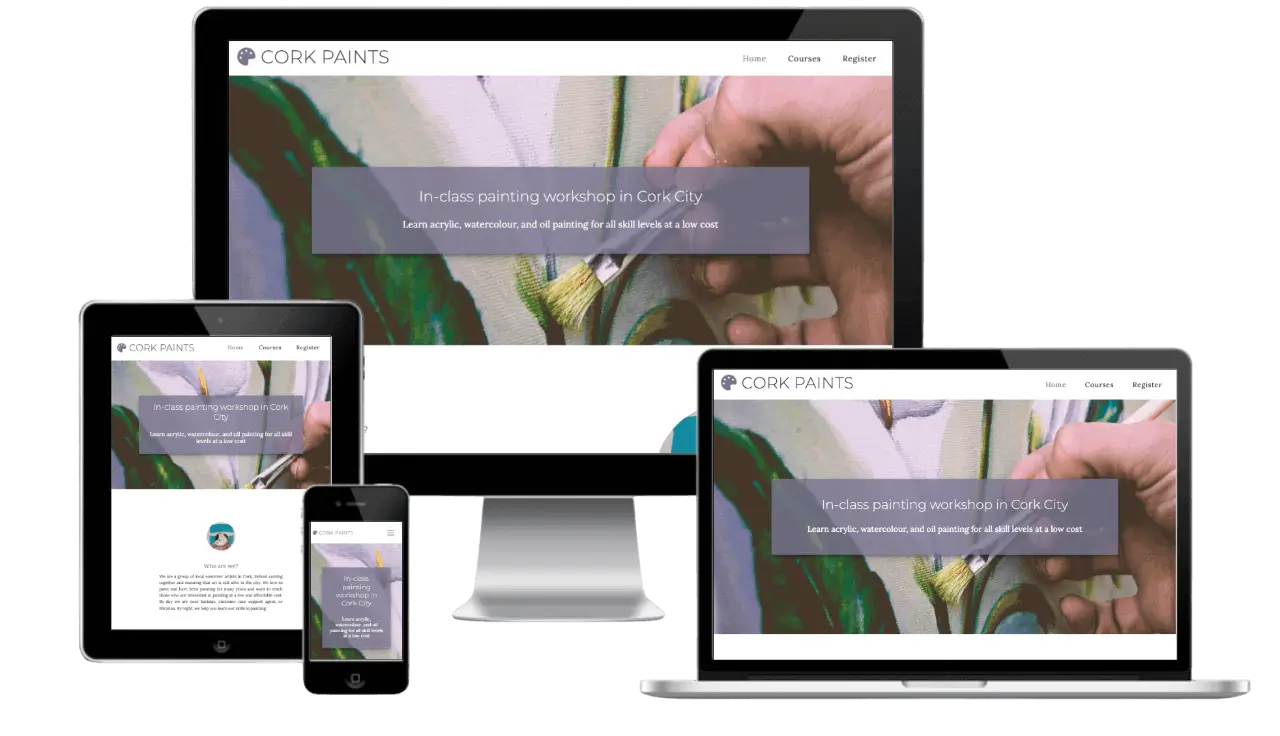
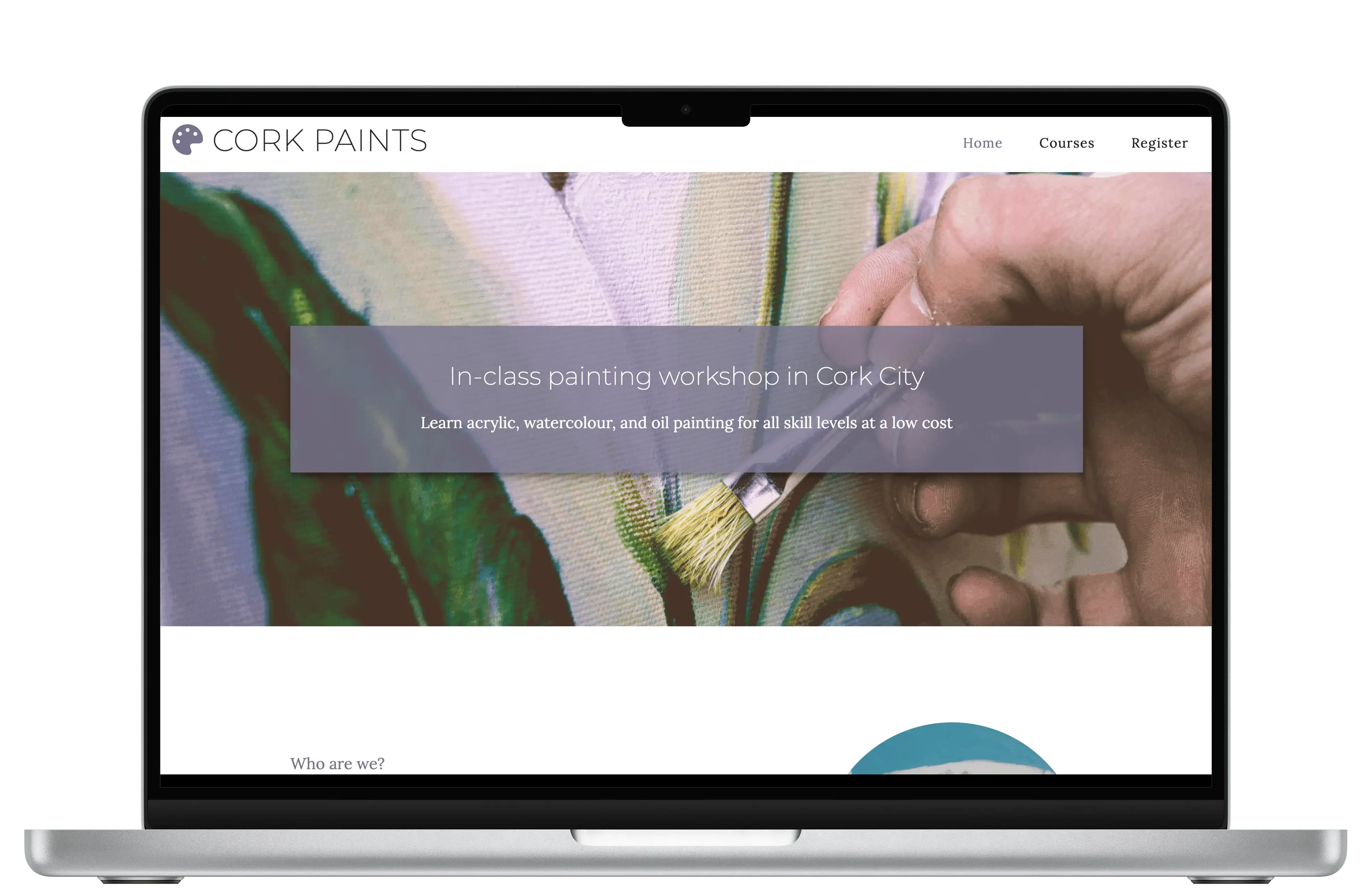
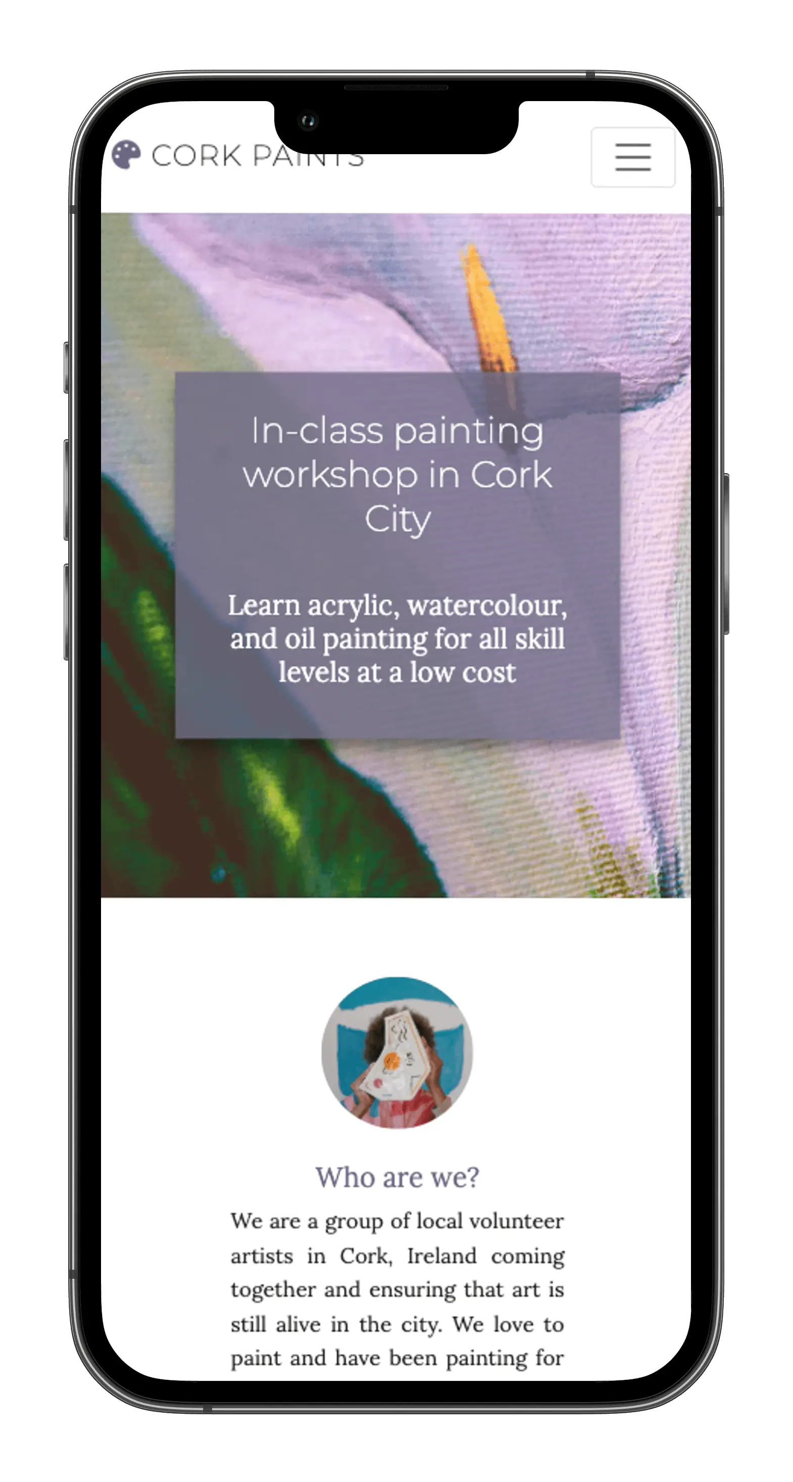
For my first solo project at Code Institute, I designed and built Cork Paints, a static website for a fictional painting workshop booking platform. The site features a clean, modern design with intuitive navigation and a fully responsive layout. This project strengthened my front-end skills in HTML, CSS, and Bootstrap, while emphasizing accessibility and user-friendly design. I was proud to earn a Distinction grade for this work.
UX Designer, Full Stack Developer
HTML, CSS, JavaScript, Bootstrap, Sketch
3 Weeks
User Stories, Wireframes, Style Guide, Development, Reflections
Cork, Ireland is home to a vibrant and growing arts community, yet finding and booking local painting workshops can be surprisingly difficult. Many existing options are scattered across library websites, social media pages, or require complicated sign-up processes involving email confirmations or third-party platforms. This fragmented experience makes it harder for both newcomers and seasoned artists to discover and join workshops in their area. There was a clear need for a centralized, user-friendly way to explore and express interest in creative events without unnecessary friction.
Problem 1: Fragmented Workshop Information
Local painting workshops are scattered across various platforms, making it hard for users to find a centralized source of information.
Problem 2: Complicated Booking Processes
Many workshops require sign-ups with email confirmations or third-party accounts, creating unnecessary barriers for users.
Problem 3: Difficulty for New and Experienced Artists
Both newcomers and seasoned artists face challenges discovering and joining local painting workshops due to the fragmented system.
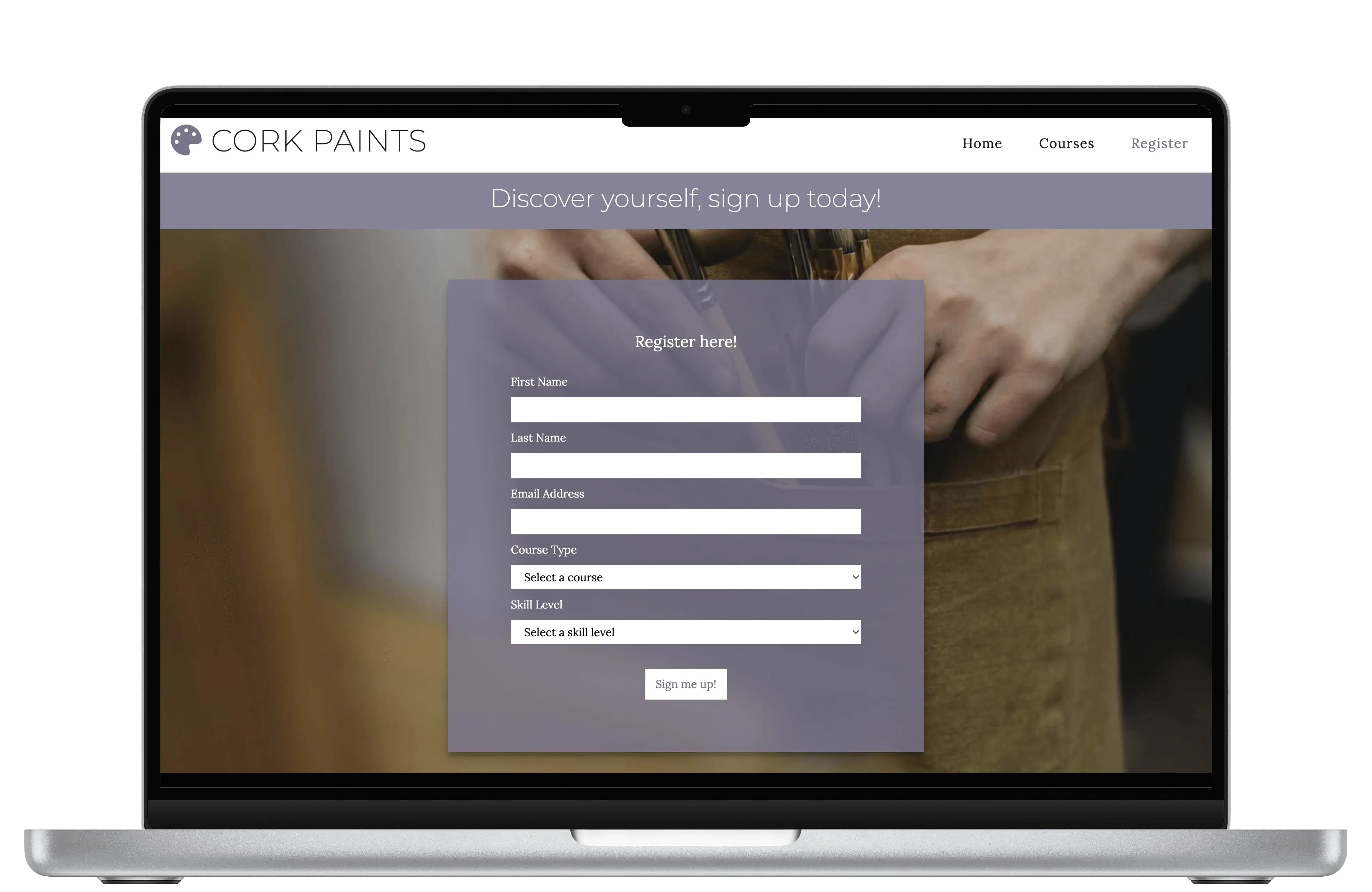
To address this gap, I created a simple, accessible workshop booking platform using HTML, CSS, and JavaScript. The site is designed to reflect the spirit of Cork’s artistic culture while making it easy for users to browse available painting workshops and register their interest through a straightforward form. While the form does not submit data to a backend, the project demonstrates the ideal user journey, consisting of clear workshop listings, clean UI, and a no-hassle registration process. This prototype envisions a more inclusive and approachable way for people to connect with Cork’s creative scene.
Solution 1: Simple and Accessible Design
Created a clean, easy-to-navigate interface that reflects Cork’s artistic culture and welcomes users of all experience levels.
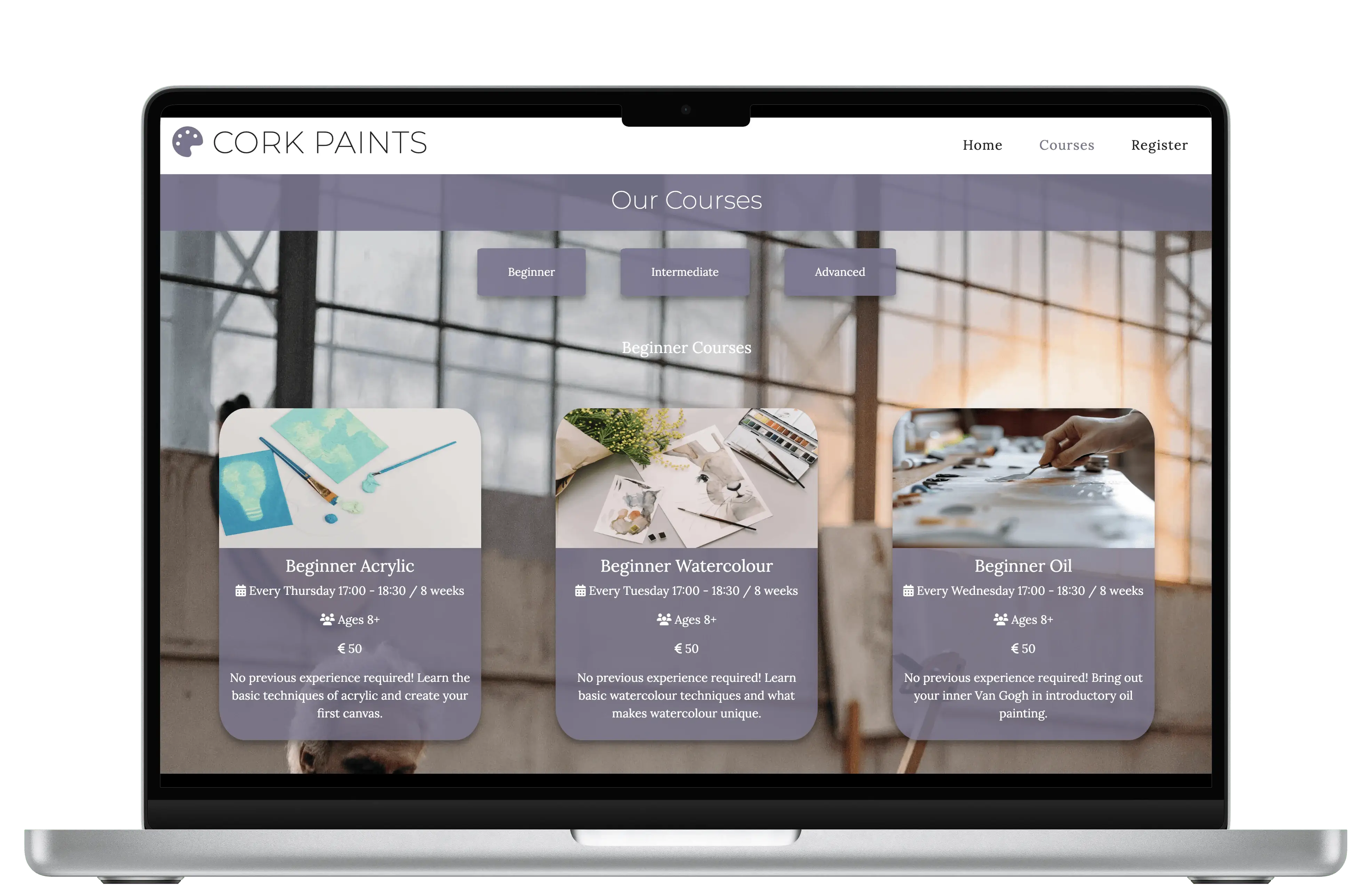
Solution 2: Clear Workshop Listings
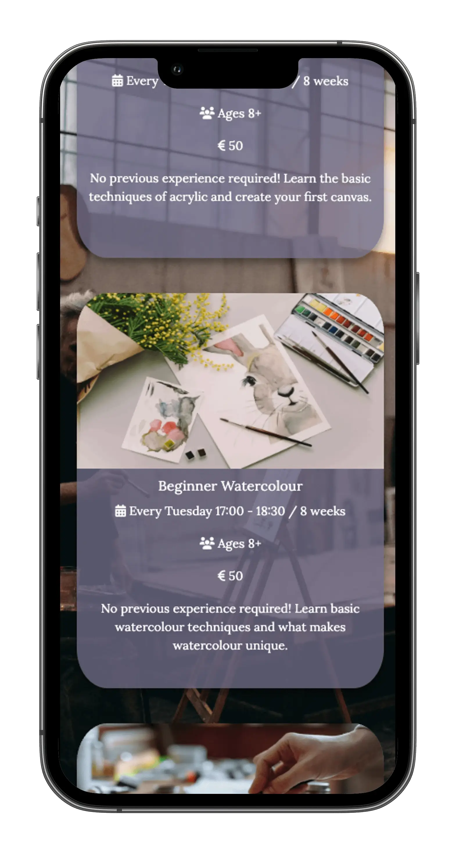
Presented painting workshops with straightforward details and a simple registration form to streamline the user journey.
Solution 3: Prototype Demonstrating Ideal Experience
Developed a functional prototype showcasing an inclusive, no-friction booking process that could be extended with backend integration in the future.
I started this project with a lot of creative freedom to design a static website, which allowed me to explore ideas freely. Reflecting on my own experience as an artist in Cork, I identified the challenge of finding and booking local painting workshops as a key pain point. This inspired me to create a simple, user-friendly platform that could make it easier for artists like me to discover and register for workshops without unnecessary hassle.
I identified my target users as beginners, hobbyists, students, and tourists seeking an enjoyable, low-pressure way to engage with painting workshops. Recognizing the diverse skill levels and interests within this group, the platform was designed to cater to a wide range, from complete novices to more experienced painters, across various mediums like watercolours, acrylics, and oils. Prioritizing simplicity and accessibility, I ensured there were no sign-up barriers, making it easy for users of all backgrounds to find and book classes that fit their needs.
I conducted a competitive audit of art institutions in Cork, including Shandon Art Studios, Crawford Art Gallery, and Cork College of FET. While these organizations offer high-quality workshops led by experienced instructors, I identified several friction points: limited seasonal availability, high costs, and registration methods that required creating accounts, long wait times, or direct communication via email or phone. These models cater well to committed learners but can deter beginners or impulsive bookers looking for a quick creative outlet.
I developed user stories centered around first-time visitors, returning users, and frequent visitors to ensure the platform meets the needs of newcomers while continuing to engage loyal customers.
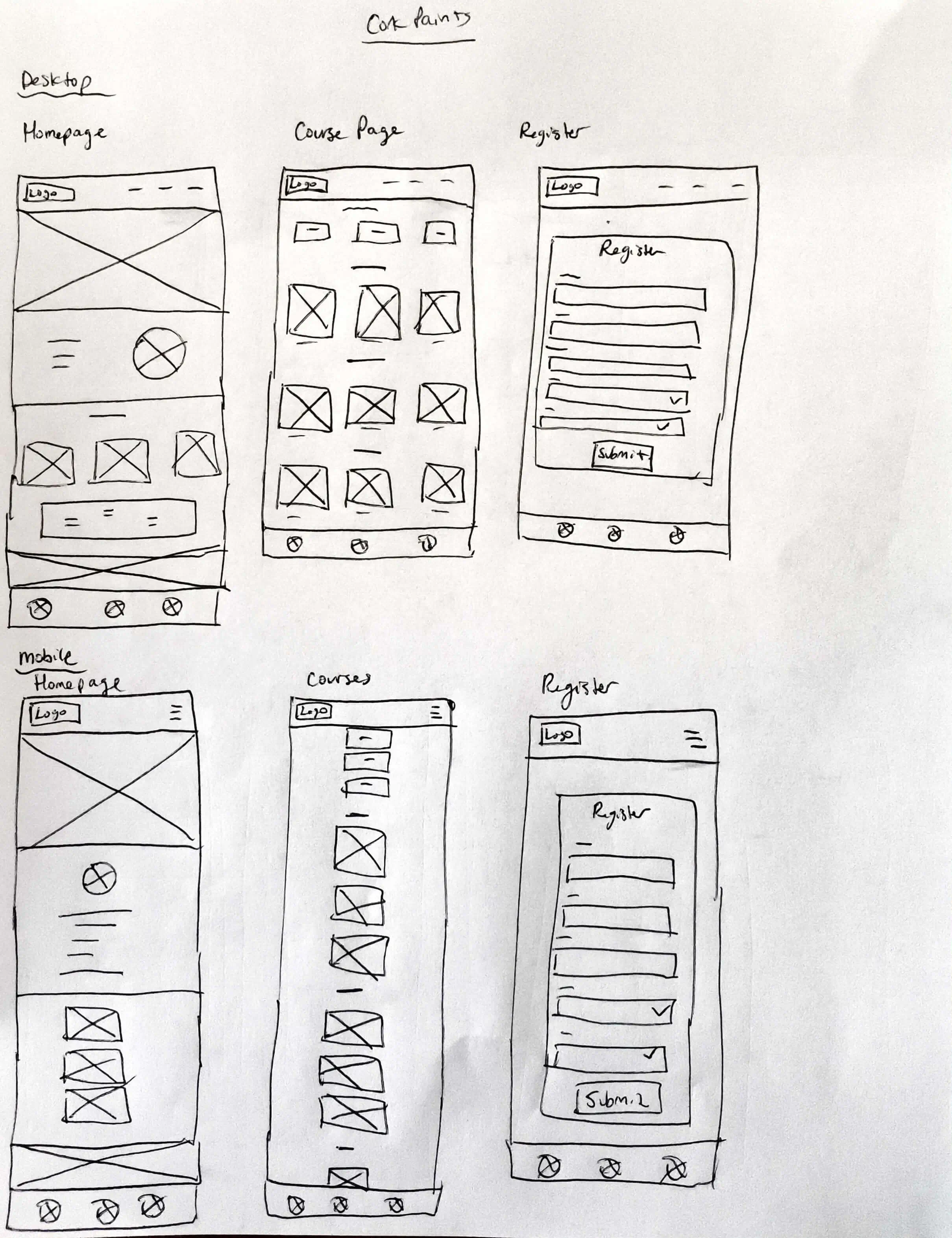
In the initial design phase for Cork Paints, I embraced a mobile-first mindset by sketching key screens and user flows on paper. This hands-on approach enabled me to quickly explore layout options, prioritize essential booking steps, and establish a clear visual hierarchy. These early sketches acted as a tactile brainstorming tool, helping to clarify how users would navigate workshop selections and registrations with minimal friction. Once the core flow felt intuitive, I digitized these concepts into low-fidelity wireframes using a simple tool, focusing on clean layouts and straightforward interactions. This foundational work ensured the final design stayed user-friendly and accessible, supporting a seamless and inviting workshop booking experience.
I began with hand-drawn wireframes to quickly explore layout and flow options without committing to visuals. This helped me rapidly ideate and sketch out key screens such as the homepage, courses page, and the registration form.
After confirming the core user flows, I created digital low-fidelity wireframes in Sketch to quickly map out the homepage, courses page, registration process, and navigation structure.
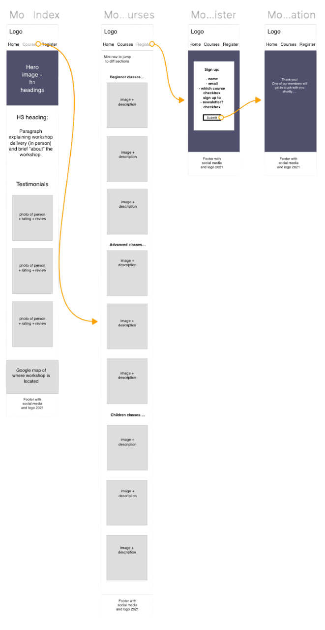
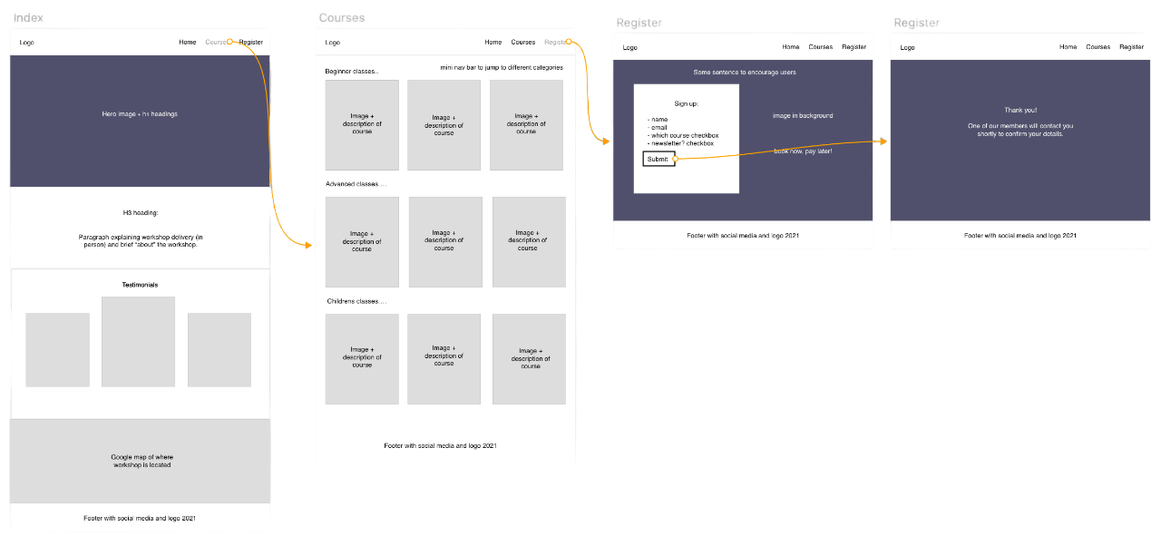
After validating core flows, I created digital low-fidelity wireframes in Sketch focused on the desktop experience. This allowed me to quickly visualize the layout of the homepage, courses page, registration page, and the overall navigation flow.
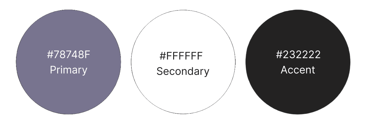
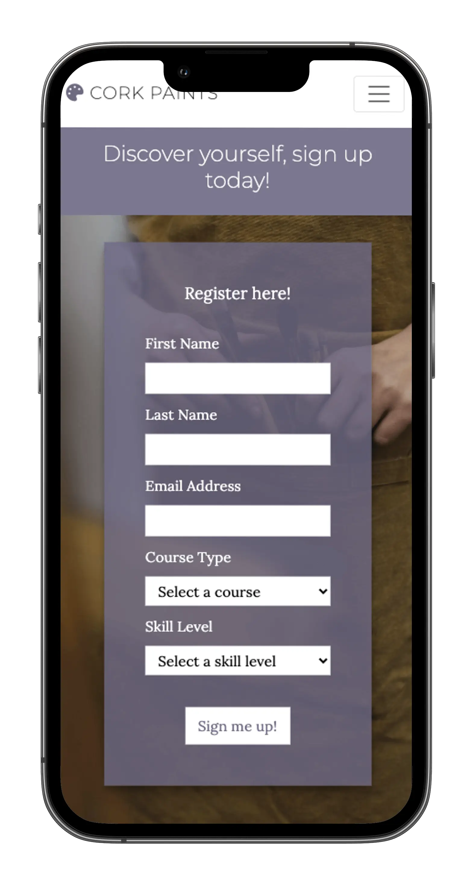
I created the style guide for Cork Paints to feature a harmonious colour palette of purple, white, and dark grey, ensuring strong contrast and readability. Typography combines the bold, modern Montserrat for headings with the elegant, readable serif Lora for body text, creating a balanced and inviting look. Imagery focuses on minimalistic, artistic photos that complement the colour scheme and reinforce the creative, painting-focused theme of the site. Together, these elements deliver a clean, accessible, and visually appealing user experience.
The logo was from Font Awesome. The goal was to feature a fun artistic-themed icon that matches the website's colour palette.
The colour palette for Cork Paints features a soft, pastel purple as the primary colour, chosen for its calming, creative tone and visual appeal. This is paired with clean white and a deep grey-black to maintain strong contrast and a minimalist aesthetic. The combination creates an inviting and accessible interface that highlights content without overwhelming the user, perfect for a creative platform focused on artistic expression and ease of use.
I began development by building the index.html page, following the low-fidelity wireframes and design guide I created to maintain consistency. After establishing the homepage structure and styling, I moved on to develop the contact page and the booking page, ensuring each aligned with the overall design and user flow. Throughout the process, I focused on clean, reusable code and tested responsiveness across devices to provide a smooth user experience.
Manual testing focused on verifying that all navigation elements functioned correctly and intuitively across devices. I thoroughly checked that the site remained fully responsive, adapting smoothly to different screen sizes. Forms were tested end-to-end to ensure submitted data accurately matched user input, with proper validation in place. This hands-on approach helped catch UI inconsistencies, confirm feature reliability, and ensure an overall seamless user experience.
The final Cork Paints product reflects the core goals of simplicity, creativity, and accessibility. Built with HTML, CSS, and Bootstrap, the site features a fully responsive layout, a smooth booking form, and clear navigation to guide users through available workshops. Throughout development, I continuously tested the site across devices and browsers to ensure consistent performance.
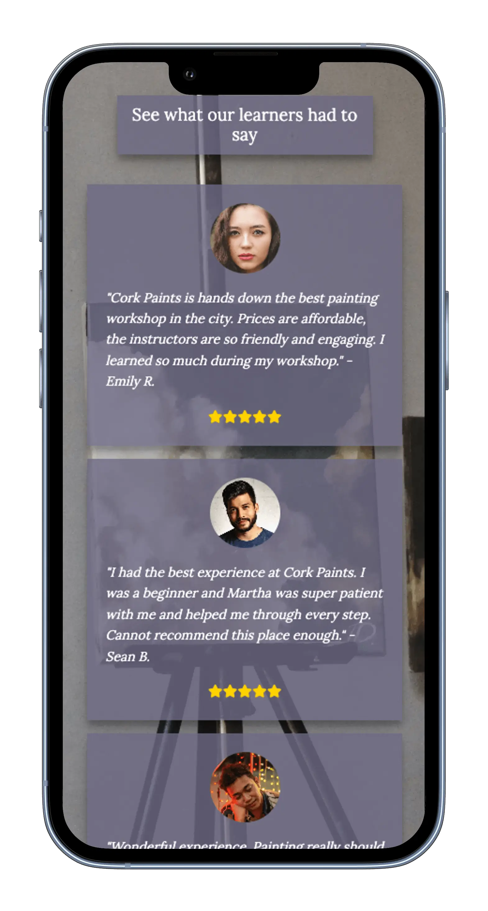
After launching the initial version, I gathered informal feedback from target users, including students and casual hobbyists, who tested the booking flow and navigation. Based on their insights, I made meaningful refinements such as improving button placements, course card layouts, and overall readability. These iterative improvements helped make the site quick, intuitive, and welcoming for all experience levels. My focused efforts on user-centred design and development earned me a Distinction grade for the project.
This being my first coding project, I learned firsthand that great ideas really can come to life with persistence and continuous learning. While I didn’t have all the technical skills at the time to build a fully functional workshop booking system, the process taught me the importance of starting simple and iterating. Today, with improved skills and experience, I’m confident I could develop a complete, production-ready platform, including real-time form submissions to a database, user authentication, and dynamic workshop management. This project fueled my passion for turning concepts into tangible solutions and showed me that every big achievement begins with a single step in coding and design.