For a personal JavaScript challenge, I solo designed and developed a simple, bug-free desktop memory game themed around Studio Ghibli. Focusing on clean code and robust error handling, I aimed to create a smooth, reliable user experience while honing my front-end development skills.
UX Designer, Full Stack Developer
HTML, CSS, JavaScript, Bootstrap
3 Weeks
User Stories, Paper Wireframes, Style Guide, Development, Usability Testing, Reflections
Many beginner-friendly JavaScript games, including memory games, often overlook robust error handling and code reliability. This leads to buggy behaviour, poor user experience, and limited scalability. There is a need for a well-structured, bug-free JavaScript game that not only offers an engaging experience but also demonstrates best practices in development, including thoughtful error handling and clean, maintainable code.
Problem 1: Poor Error Handling
Many beginner JavaScript games lack proper error handling, resulting in buggy behaviour and crashes that frustrate users.
Problem 2: Unreliable Code Structure
Inadequate code organization and maintainability limit scalability and make future improvements difficult.
Problem 3: Subpar User Experience
Buggy gameplay and inconsistent interfaces reduce player engagement and overall enjoyment.
To address the lack of JavaScript games with proper error handling and user-focused design, I created a Studio Ghibli-themed memory game using HTML, CSS, and JavaScript. The goal was to go beyond a basic game by implementing thoughtful error handling to ensure smooth and bug-free gameplay. I conducted usability testing to gather feedback and understand how real users interact with the game, which informed improvements to both functionality and interface. I also researched best practices in front-end error management to strengthen the game's reliability and code structure.
Solution 1: Robust Error Handling
Implemented comprehensive error management to ensure smooth, bug-free gameplay and prevent crashes.
Solution 2: User-Centred Design
Designed a simple, engaging interface inspired by Studio Ghibli themes, focusing on accessibility and ease of use.
Solution 3: Usability Testing and Iteration
Conducted real user testing to gather feedback and refined the game’s functionality and interface accordingly.
Solution 4: Best Practices in Code Structure
Researched and applied front-end development best practices to create clean, maintainable, and scalable code.
As a solo developer, I started by researching classic memory games to grasp their core mechanics and what makes them enjoyable. While exploring existing JavaScript versions, I noticed many were easily manipulated, which motivated me to focus on creating a more reliable and fair game. I carefully planned the visual design to make it appealing and studied JavaScript best practices to implement solid, maintainable code from the outset.
I identified the target users for Memory Game as casual players and beginners seeking a simple, enjoyable pastime, as well as those looking for a quick, engaging challenge. Understanding that many players might be unfamiliar with digital games, I focused on creating an intuitive interface with clear instructions to make the game accessible to all skill levels. Recognizing that desktop users benefit from larger screens and precise controls, I optimized the game primarily for desktop play, while prioritizing accessibility and simplicity to minimize frustration and maximize enjoyment.
For the competitive analysis of Memory Game, I reviewed a variety of homemade JavaScript memory games available online. While many offered basic gameplay, I noticed common issues such as frequent bugs, lack of robust error handling, and weak user input validation. These shortcomings sometimes allowed users to manipulate the game to cheat or caused the game to behave unpredictably, detracting from the overall experience. This insight informed my approach to building a more polished and reliable game, with careful attention to error handling, game state management, and a smooth, bug-free user experience.
I developed user stories focused on first-time visitors, returning users, and frequent players to ensure the game remains fun, engaging, and encourages continued user retention.
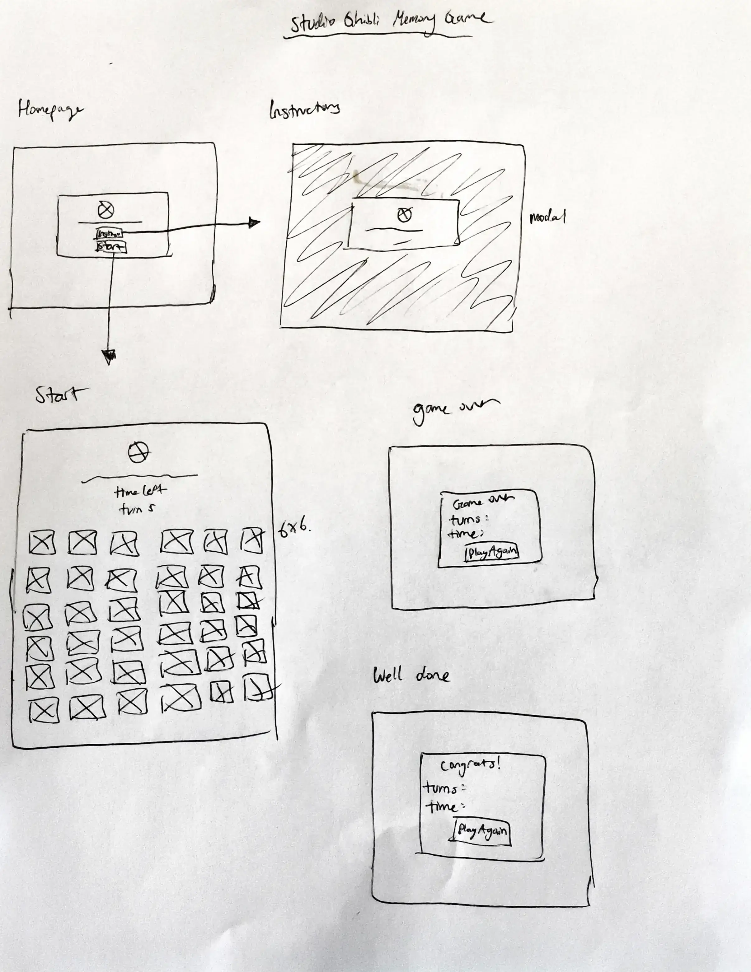
In this project, I chose to create only paper wireframes as a foundational step to keep my focus sharp on designing a clear and intuitive user flow. This hands-on approach helped me carefully consider proper error handling and user interactions before moving into development, ensuring the experience would be smooth and frustration-free.
I started with hand-drawn wireframes to swiftly map out layout and user flow concepts without focusing on detailed visuals. This approach allowed me to quickly brainstorm and sketch essential screens like the homepage, information page, and card layout.
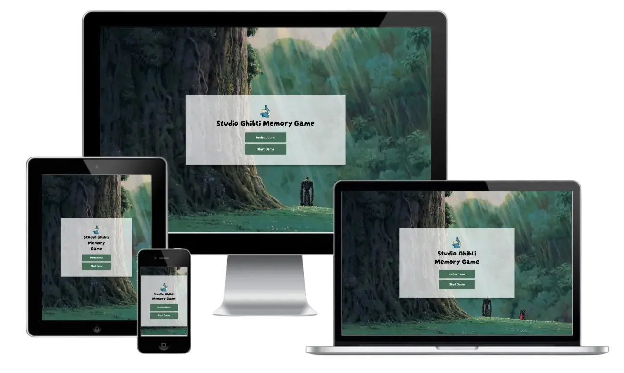
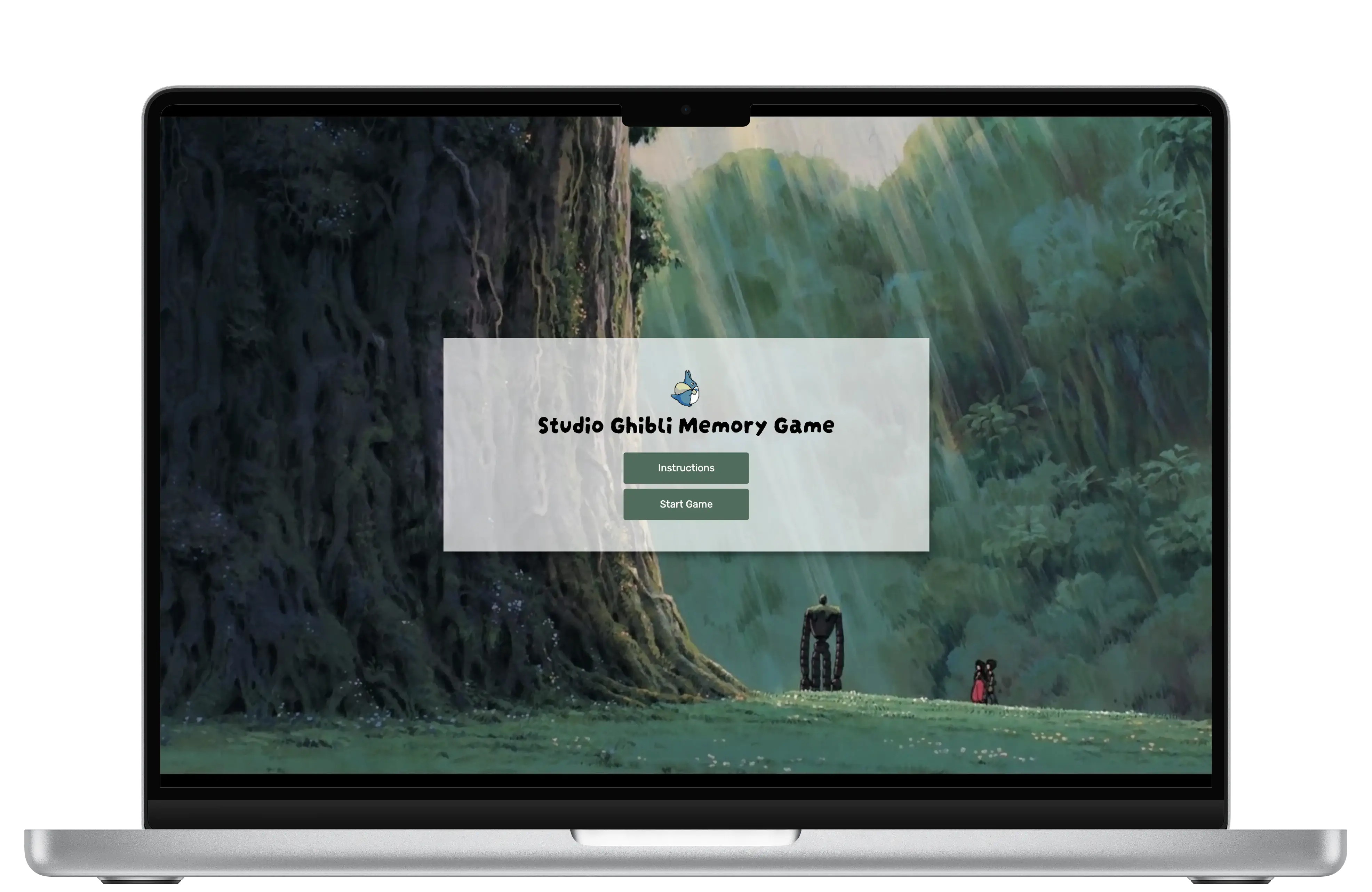
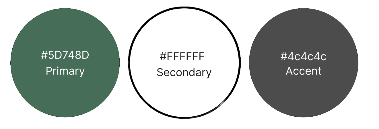
I created the style guide for the Studio Ghibli Memory Game to evoke a playful yet cohesive aesthetic. I chose a soft, charming colour palette of pastel greens, whites, blacks, and greys to ensure strong contrast and clear visuals. For typography, I paired the cursive Darumadrop One for headings, capturing the warmth and whimsy of the Studio Ghibli world, with the clean, modern Rubik for body text to keep readability and structure. I selected imagery and icons that reflect the fantastical, storybook quality of Ghibli films to enhance the game’s charm while maintaining usability. These design choices combine to create a magical and user-friendly experience that appeals to both fans and newcomers.
Although a clear logo is not established for this project, various Studio Ghibli-themed images are used throughout for each interaction with the user.


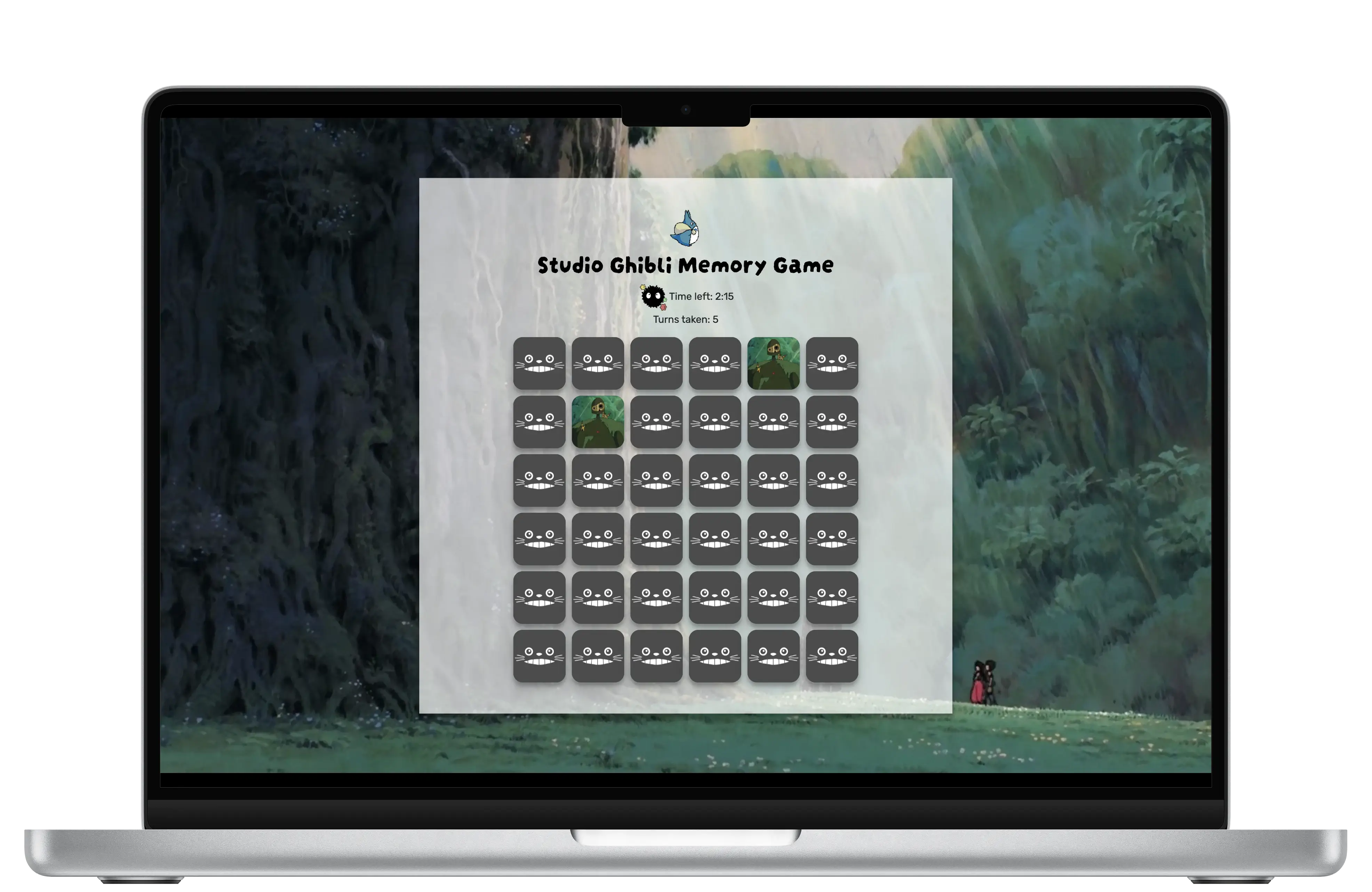
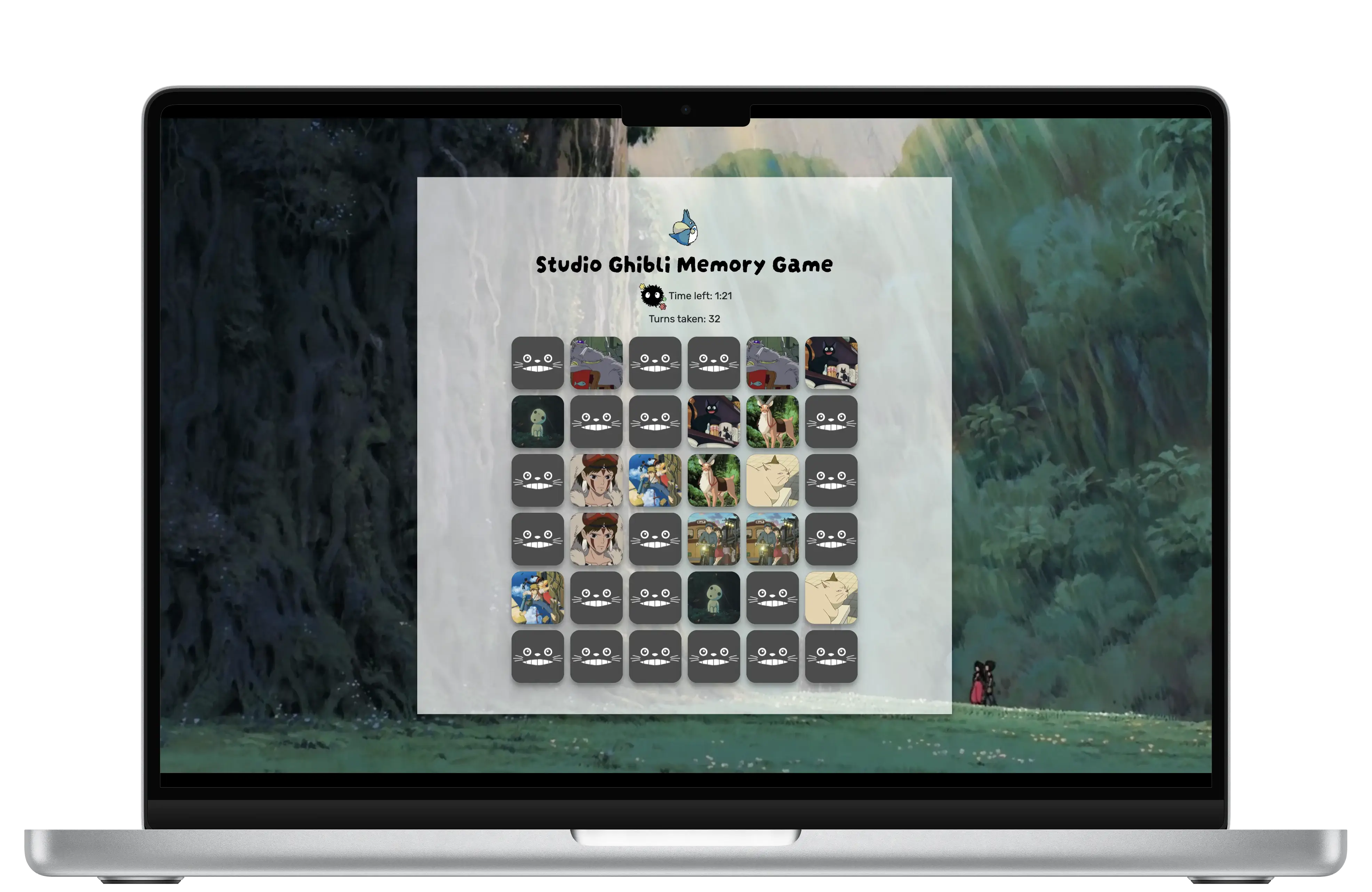
The gameplay cards all have the same grey Totoro-themed default card to promote unity and allow the users to understand which cards are not flipped over. There are two pairs of each matching cards from various Studio Ghibli movies.


The colour palette for the Studio Ghibli Memory Game draws inspiration from the enchanting, forest-filled worlds of Ghibli films. A rich, earthy green was chosen as the primary colour to reflect the natural tones of the studio’s iconic landscapes. This is complemented by a neutral dark grey used as an accent to add depth and subtle contrast throughout the interface. A clean white acts as the secondary colour, ensuring clarity and visual balance without overwhelming the charm of the design. Together, these colours create an immersive, playful experience that captures the spirit of Studio Ghibli while remaining accessible and engaging.
I started by setting up the basic project structure and creating the core HTML layout. Then, I implemented the JavaScript logic for the memory matching mechanics, focusing first on game functionality before enhancing the visuals with CSS. Throughout development, I tested the game regularly to catch bugs early and ensure smooth gameplay. I kept the code modular and organized for easier maintenance and future improvements.
I carried out both manual and usability testing to ensure the game functioned reliably on desktop browsers. Manual testing focused on verifying navigation flow, gameplay accuracy, and overall feature stability. Usability testing provided real user insights, revealing interaction issues like unclear modal behaviour and a browser-specific bug with matched pairs, which were addressed to improve the experience.
The primary goal was to test for a range of real-world use cases that may have been overlooked during development. With the first deployment as my prototype, I aimed to evaluate how users interacted with the platform across different devices (laptops and desktops), browsers, internet speeds, and skill levels. This included identifying any pain points related to responsiveness, accessibility, and error handling under varying conditions. By observing diverse usage scenarios, I could uncover usability issues that might not appear in ideal environments.
I conducted both moderated and unmoderated usability tests to gather a wide range of feedback. The moderated sessions took place in person, where I observed users as they interacted with the memory game and encouraged them to think aloud while completing tasks such as matching pairs, experimenting with mismatches, and exploring game mechanics like what happens when you unmatch a pair.
For the unmoderated sessions, participants completed the same tasks remotely, with sessions lasting 15–20 minutes and screen recordings captured for later review. This mixed approach allowed for both real-time observation and natural user behaviour analysis in different environments.
Five participants aged 25–40 took part in testing. I intentionally selected users with varying levels of tech proficiency, from casual web users to junior developers, to reflect the likely audience for a lightweight browser-based game. Some participants were also fans of Studio Ghibli, which helped gauge whether the themed design resonated as intended. Testing was conducted on a mix of laptops and desktops, ensuring coverage across different screen sizes and user behaviours.
"It's very cute but it's a bit difficult to read some text."
"Uhh, I accidentally unmatched a pair and now I have three cards flipped over?"
"How do I get out of the information screen?"
"Wait, so, was that a correct match?"
Usability testing revealed several important insights. Users experienced challenges with the information modal usability, accessibility issues related to text contrast, a browser-specific bug affecting matched pairs, and some confusion around card flip timing. These findings guided targeted improvements to enhance the overall user experience.
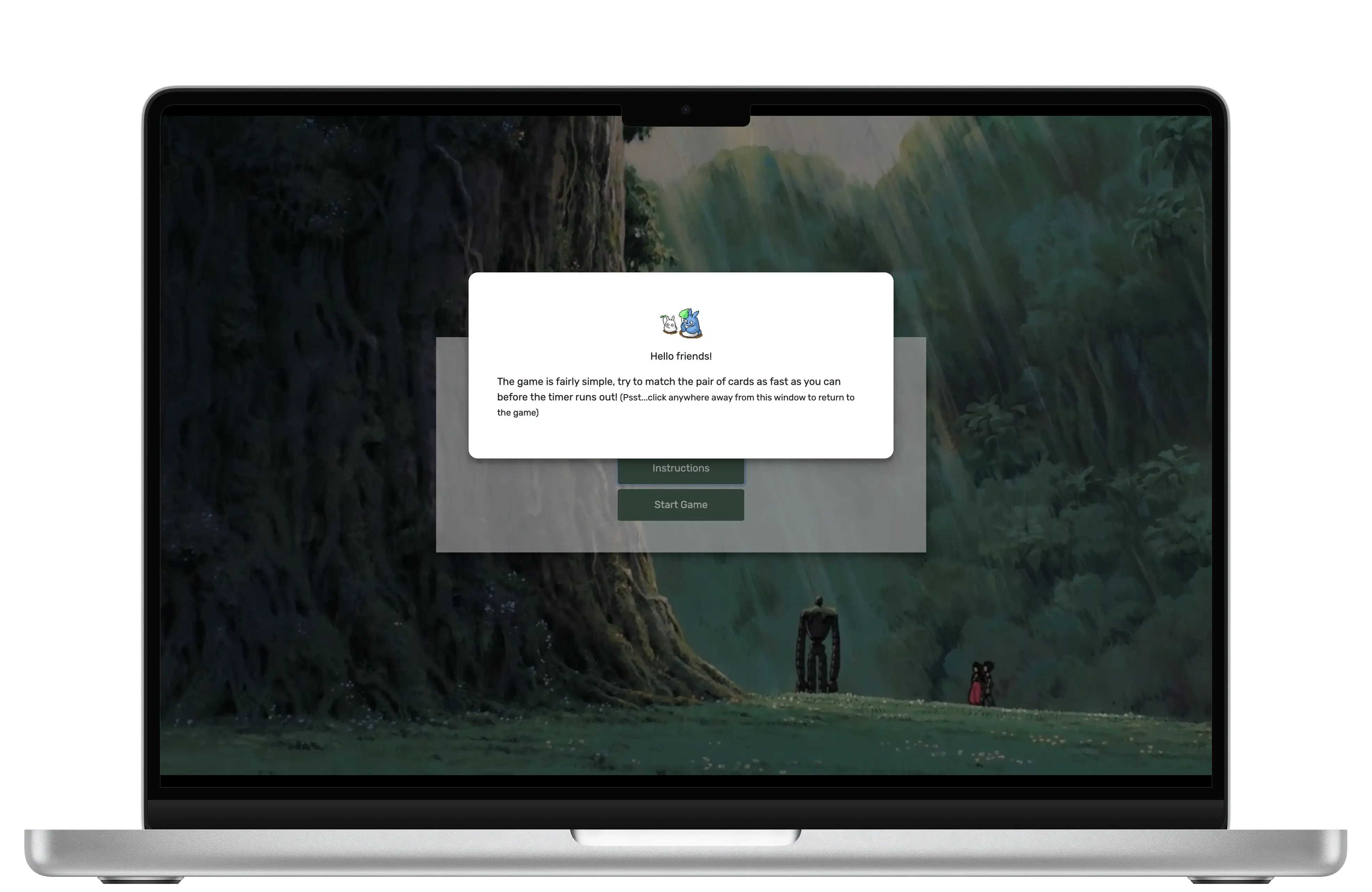
Key Finding 1: Information Modal Usability
60% of users struggled to understand how to close the information modal promptly.
Key Finding 2: Accessibility Concerns
While most of users liked the Studio Ghibli theme, 60% found that some text elements lacked adequate contrast, impacting readability.
Key Finding 3: Browser-Specific Bug
40% of users encountered a bug that allowed matched pairs to be dragged, causing them to become unmatched unintentionally.
Key Finding 4: Card Flip Delay Confusion
20% of users were initially confused by the delay in card flipping, leading to difficulty recognizing matched pairs.
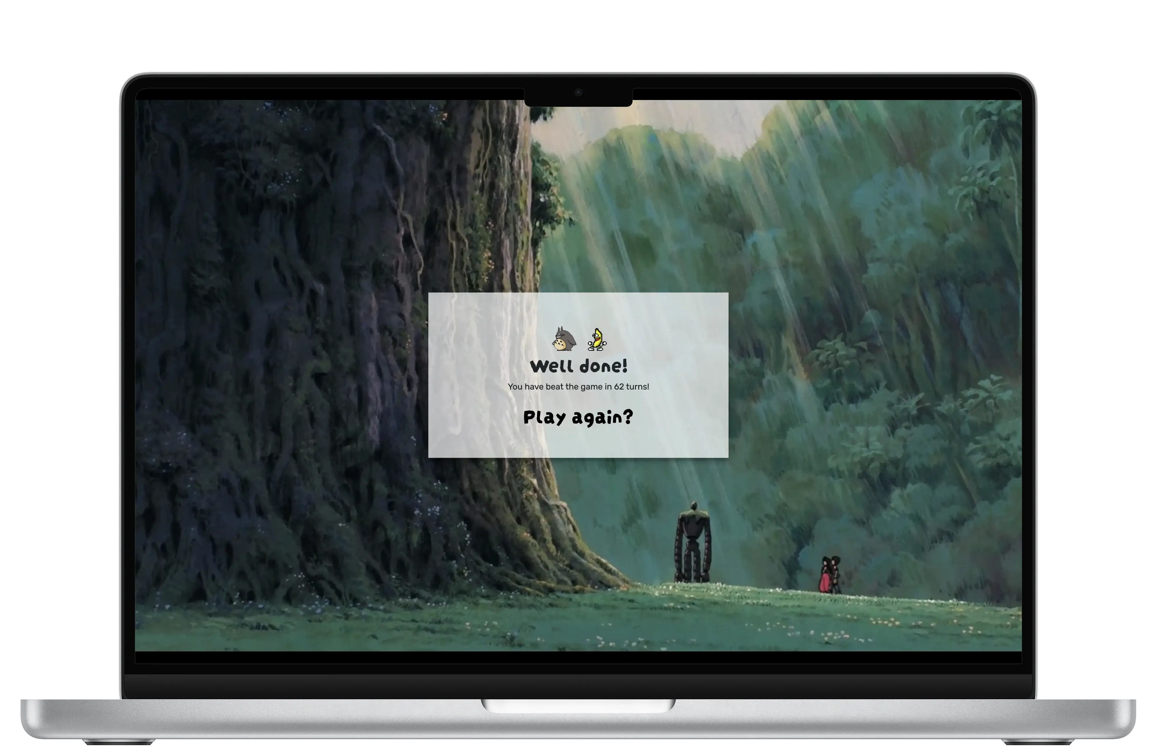
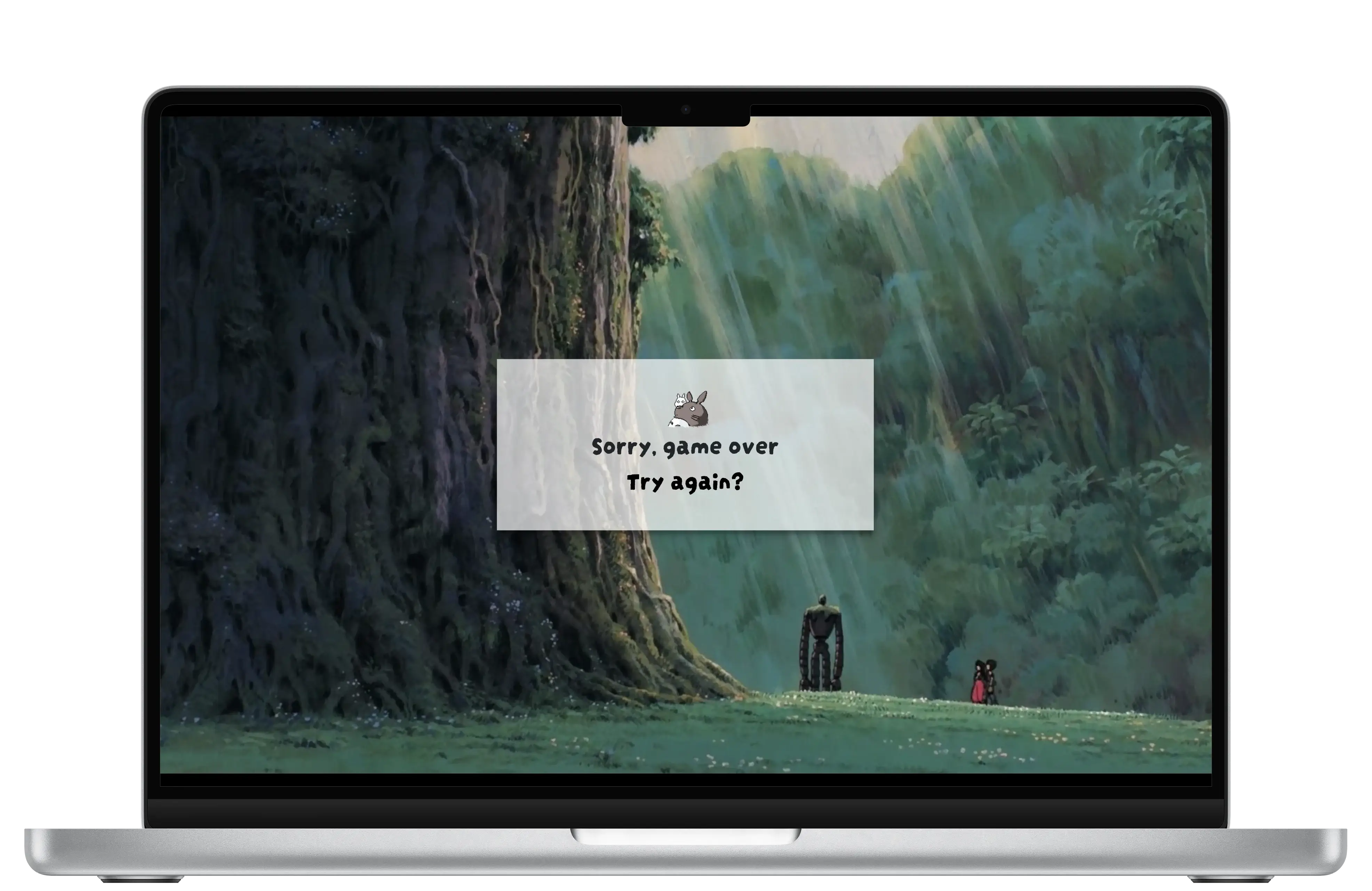
The final Studio Ghibli Memory Game is a robust, functional JavaScript matching game that brings charm and playfulness to the user experience. Built with HTML, CSS, and JavaScript, the game features a fully functional layout, intuitive card-flipping animations, and a clean interface inspired by the enchanting spirit of Studio Ghibli films. The user’s turns increment correctly after each pair of flips, and the timer countdown decreases per second as intended, ensuring engaging and smooth gameplay.
Through usability testing, I uncovered edge cases and friction points that were not initially apparent. This allowed me to iterate on key interactions and enhance the overall experience. Continuous manual testing across multiple devices and browsers helped verify consistent performance and responsiveness.
Based on user feedback, I implemented several targeted improvements: matched pairs are now locked by completely removing event listeners to prevent a browser-specific bug that allowed dragging unmatched pairs; the information modal screen was updated with small instructional text informing users that clicking outside the modal closes it; text sizes and colors were adjusted to improve contrast and accessibility; and a ‘chime’ sound was added to signal correctly matched pairs, providing clearer visual and auditory feedback.
I also conducted follow-up interviews with the same five participants using the latest version of the game. These sessions confirmed the effectiveness of the improvements, with users reporting a more intuitive, enjoyable experience and fewer usability issues. Overall, the iterative process of design, development, and testing ensured a polished final product that delivers a joyful, accessible, and thematically resonant experience aligned with the storytelling magic of Studio Ghibli.
Improvement 1: Theme Appreciation
80% of users expressed strong enjoyment of the Studio Ghibli-inspired design and visuals.
Improvement 2: Replay Motivation
90% of participants reported feeling competitive and motivated to play the game again.
Improvement 3: Usability
80% of users found the navigation and controls intuitive and easy to use after updates.
Improvement 4: Accessibility Enhancements
90% of users acknowledged improved readability and accessibility with updated text sizes and contrast.
This project taught me how valuable real user input is, especially when it highlights things I completely overlooked as both the designer and developer. It was interesting to see how differently users interacted with features I thought were intuitive. As I focused heavily on design, I realized that translating visual ideas into working code brings its own set of challenges. In future projects, I want to prioritize accessibility and expand to mobile screens, especially as mobile use continues to grow. I will also prepare high-fidelity wireframes to be prototyped before the development process to catch any edge cases early.